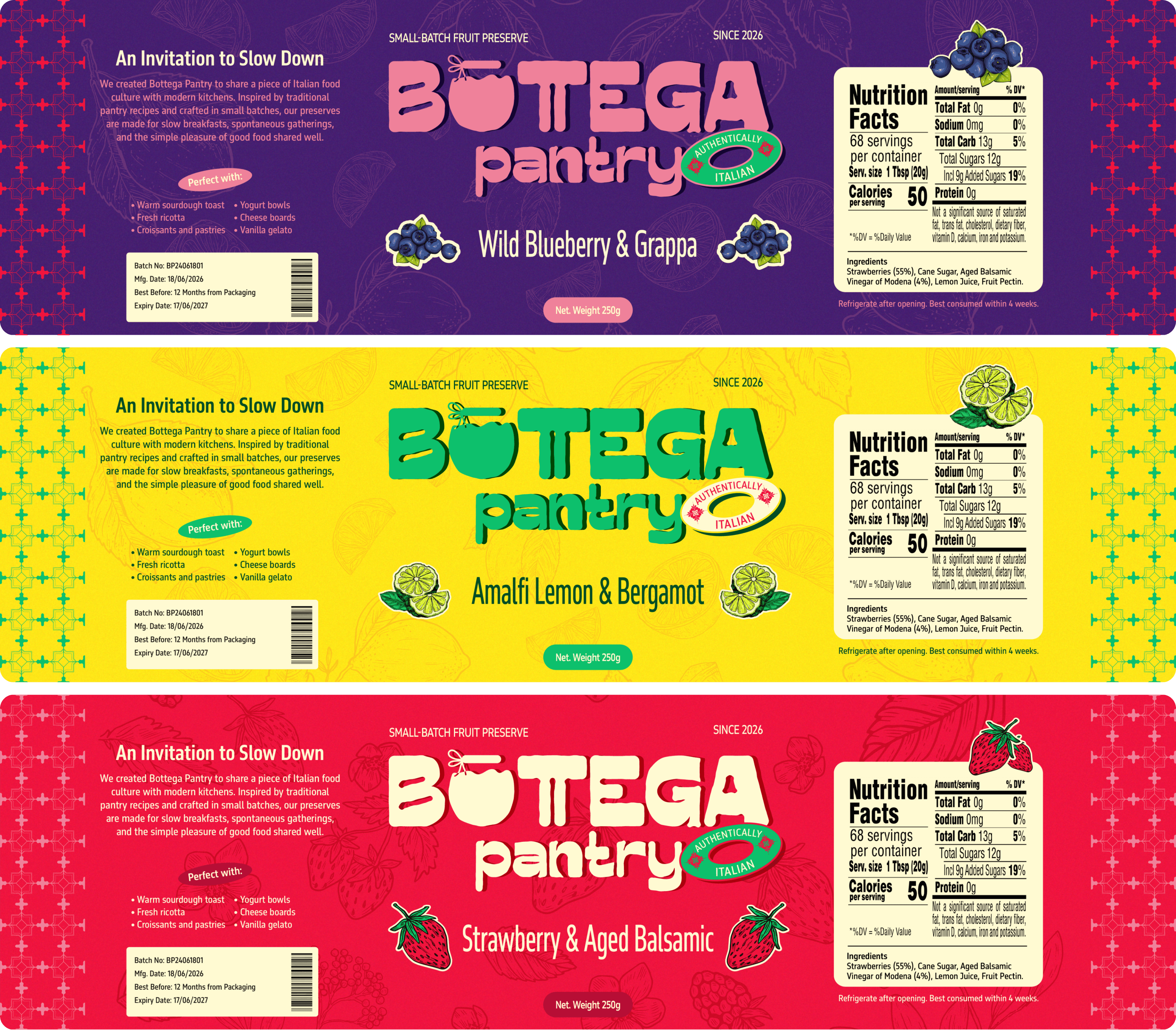
Bottega Pantry
An Invitation to Slow Down
Bottega Pantry is a contemporary preserves brand inspired by the warmth of Italian food culture. Created as part of a branding challenge, the project explores how strategy, storytelling, and packaging can transform an everyday product into something people genuinely connect with.
Client
Personal Project
Year
2026
Industry
Food & Beverage
Turnaround time
7 days

The Brief
Design a preserves brand inspired by Italy without falling back on the usual clichés. No Vespa, no pizza, no tricolour flags. Easy... right?
The Idea
Instead of selling jam, I wanted to sell the feeling of slowing down. The long breakfasts. The family tables. The little rituals that make food memorable.


The Process
I explored everything from logo sketches and typography to colours, patterns, and packaging. Every decision was rooted in warmth, craftsmanship, and a sense of discovery, giving each flavour its own personality while keeping the brand consistent.
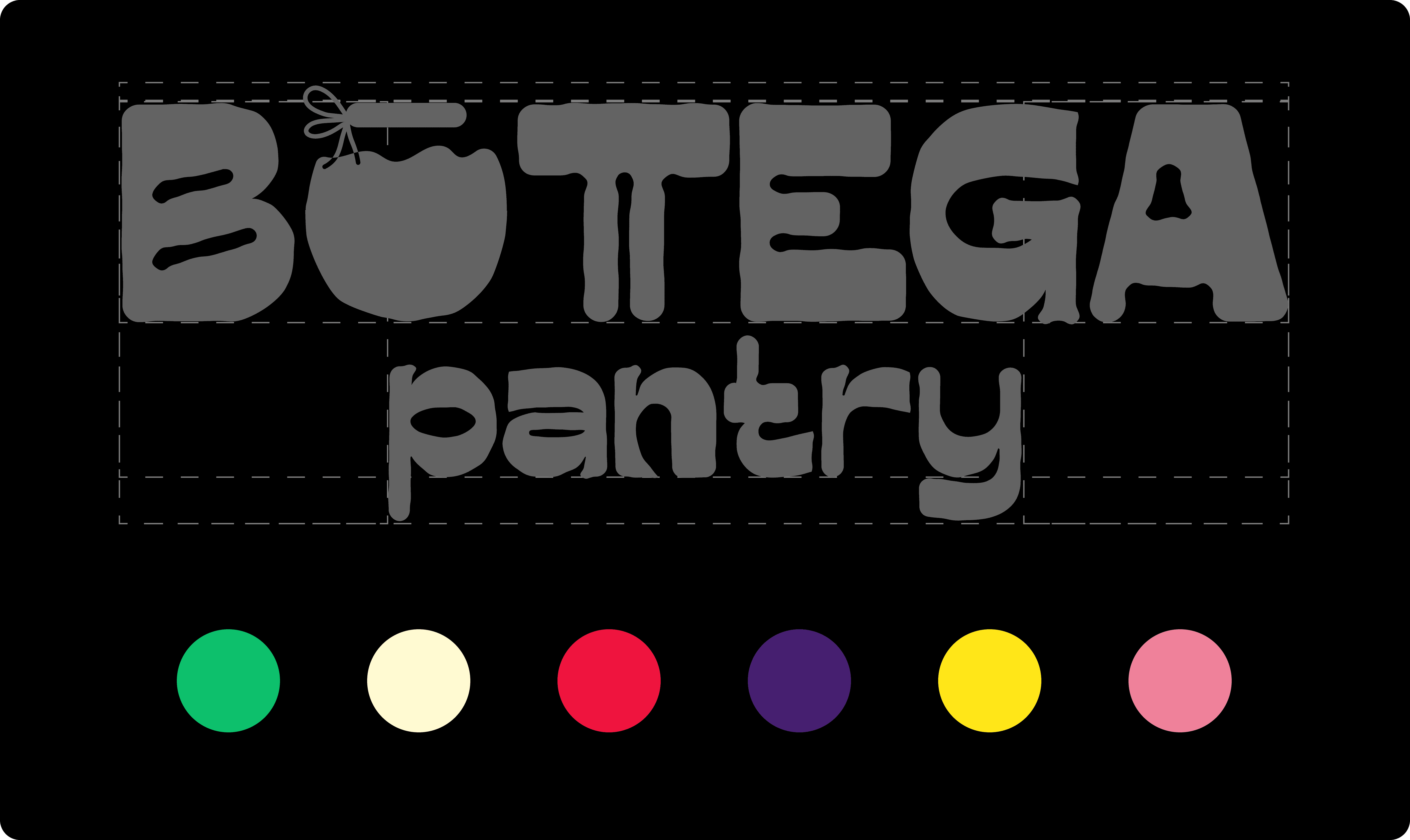
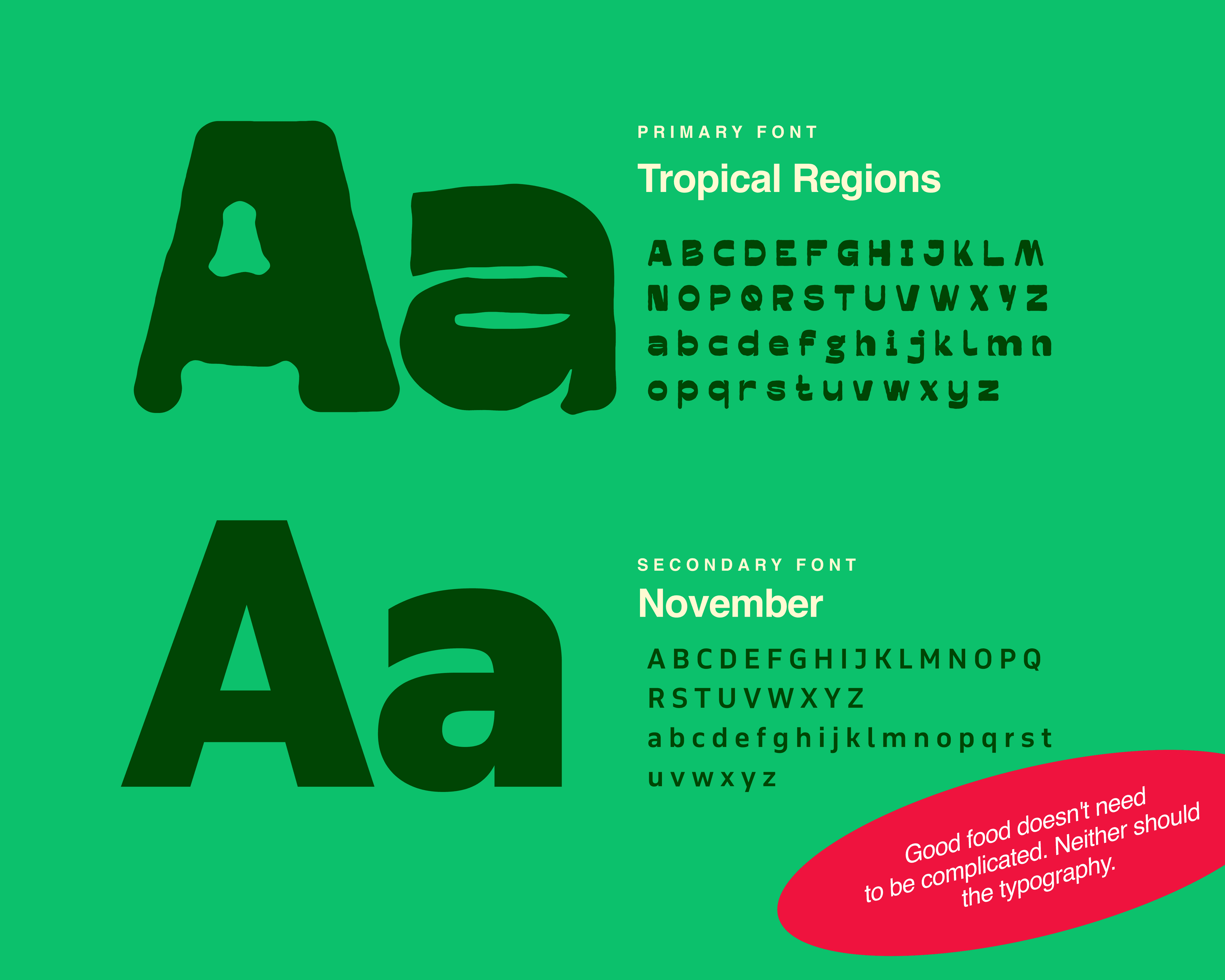
Typography
Bold when it needs attention, friendly when it tells a story. The type system was designed to be expressive, approachable, and easy to spot on a busy shelf.
Colours
The colours come from the pantry, not the flag. Every flavour has its own personality, creating a system that's vibrant, memorable, and easy to navigate.
The Outcome
What started as a branding challenge turned into a complete brand world. From strategy to packaging, every piece was designed to make Bottega Pantry feel like a brand you'd happily discover on a grocery shelf, and take home.